
CASE STUDYSOLVANATECH / 21Vélora / Packaging
Design study / VÉLORA / Packaging
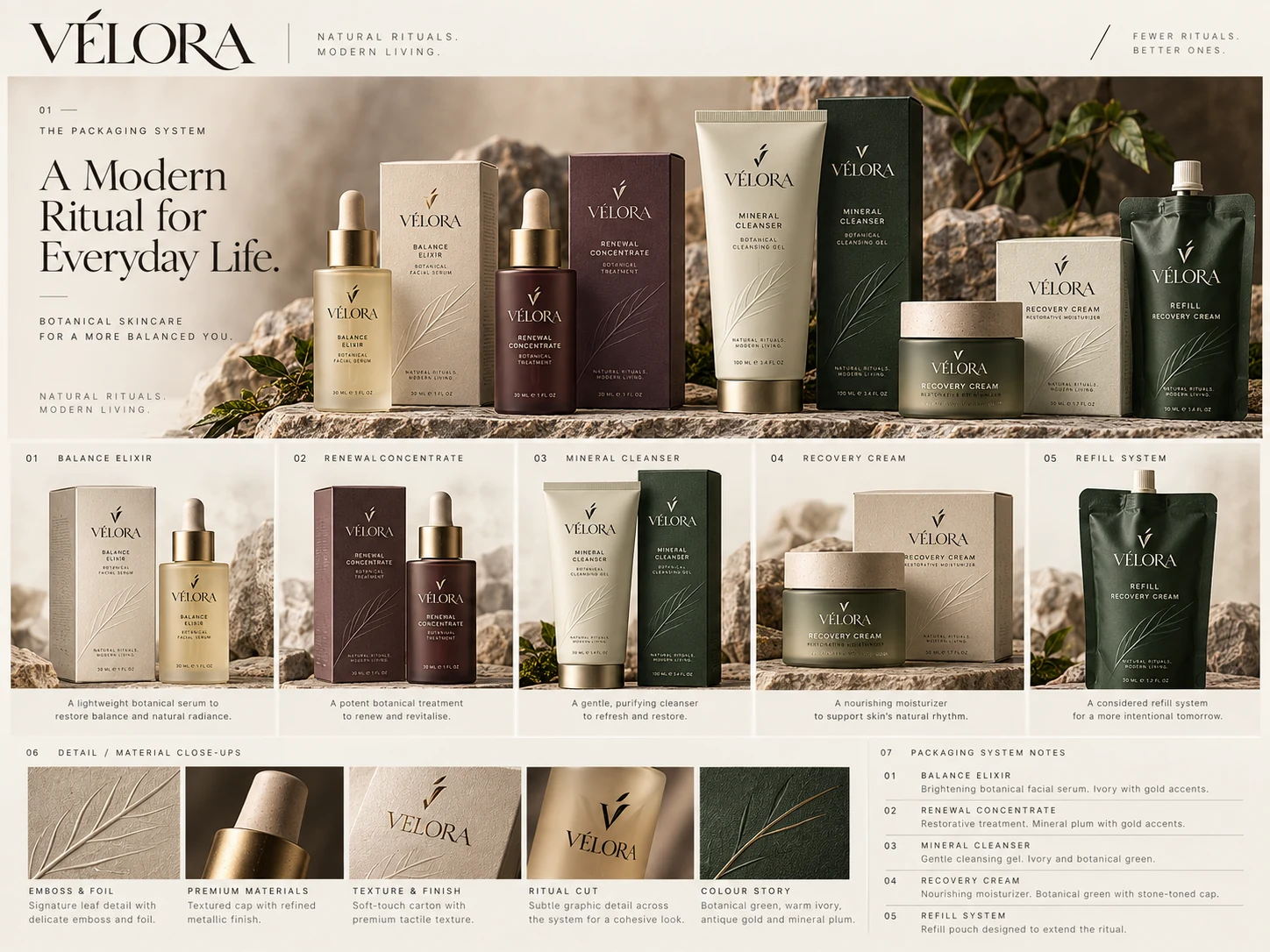
Packaging designed as a family, not a collection of isolated SKUs.
The system gives every product a clear place while preserving material restraint, hierarchy and shelf recognition.
01 / Packaging
A coherent product architecture.
Balance Elixir, Renewal Concentrate, Mineral Cleanser, Recovery Cream and the refill system share a common language while using controlled color to create distinction.
02 / Packaging
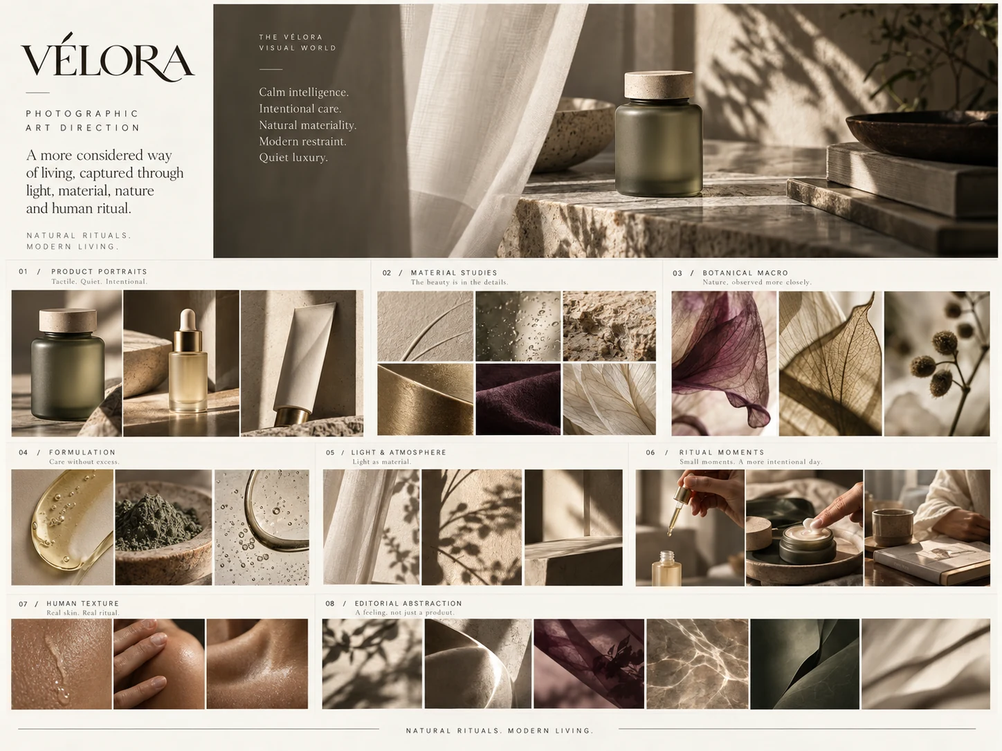
Materiality carries the premium signal.
Frosted glass, soft-touch cartons, restrained metallic accents and tactile paper do more work than decorative graphics.
Start a project
Build the brand and the digital experience as one system.
Tell us what you’re trying to improve. We’ll help you identify whether the highest-leverage move sits in design, visibility or the systems behind it.