
CASE STUDYSOLVANATECH / 20Vélora / Identity
Design study / VÉLORA / Identity
A quieter identity with enough character to own the shelf.
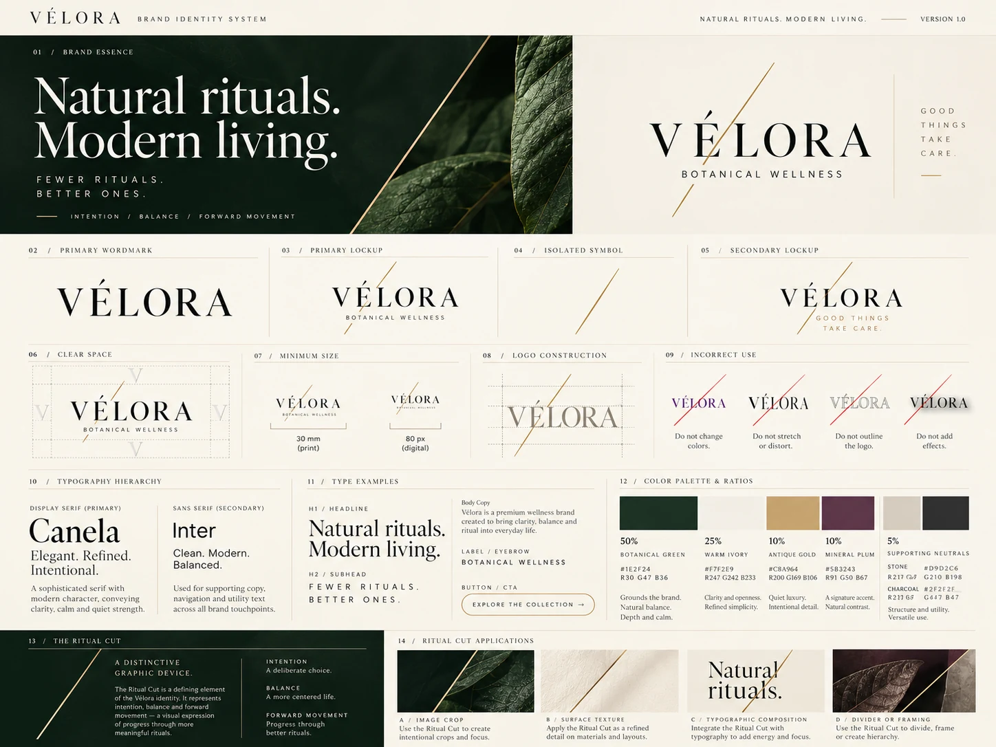
The identity system balances editorial serif typography, modern utility type, botanical green, mineral plum and the supporting V monogram.
01 / Identity
The wordmark leads.
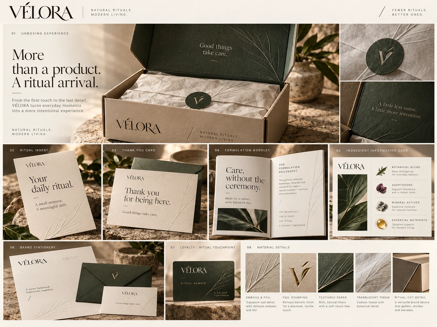
The primary wordmark carries the brand’s premium editorial character; the monogram supports it in small-scale and tactile applications.
02 / Identity
Distinctive without becoming decorative.
The Ritual Cut adds a controlled diagonal tension that can move across layouts and media without overwhelming the identity.
Start a project
Build the brand and the digital experience as one system.
Tell us what you’re trying to improve. We’ll help you identify whether the highest-leverage move sits in design, visibility or the systems behind it.